
This blog post is part three of a series on “Monitoring Serverless Applications Metrics”. See the introduction post for details and links to other posts.
Having configured collecting serverless metrics from IBM Cloud Functions (Apache OpenWhisk) applications, monitoring incoming metric values will alert us to problems.
IBM Cloud Monitoring provides a Grafana-based service to help with this.
Grafana is an open source metric analytics & visualization suite. It is most commonly used for visualizing time series data for infrastructure and application analytics.
Serverless metrics can be monitored in real-time using custom Grafana dashboards.
Let’s review a few Grafana basics before we start setting up the serverless monitoring dashboards…
Grafana Basics
Metric Data Values
Metrics data collected through the IBM Cloud Monitoring Service uses the following label format.
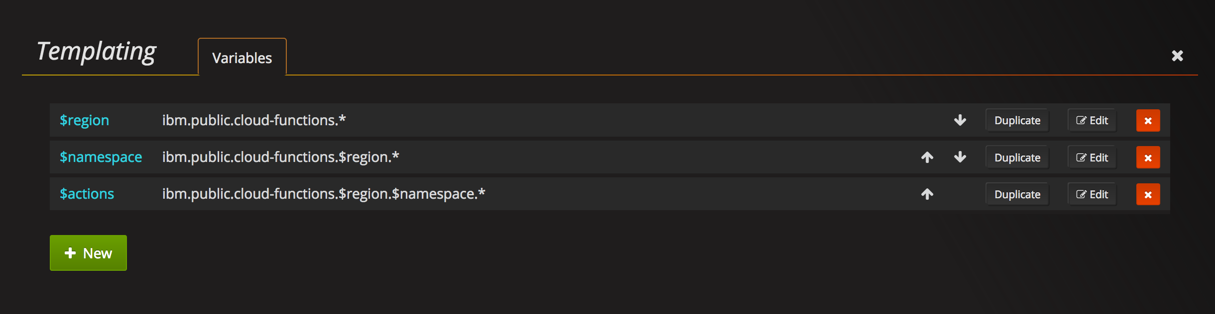
ibm.public.cloud-functions.$region.$namespace.$action.$activation.$labels
Templated variables ($varname) are replaced during collection by the monitoring library.
- $region - Geographic region for IBM Cloud Functions instance.
- $namespace - User namespace containing monitored actions.
- $activation - Activation identifier associated with metric values.
- $labels - One or more labels to identify metric data, e.g.
time.duration
Metric values must be rational numbers. IBM Cloud Monitoring does not support other data types.
Templates
When defining metric queries, hardcoding values for region, namespace or action names does not scale when monitoring multiple serverless applications. Developers would need to replicate and maintain the same dashboards for every application.
Grafana uses template variables to resolve this problem.
Templates allow users to define a variable identifier with a user-defined value. Identifiers can be used in metric queries instead of hardcoded values. Changing template values automatically updates queries.
Common Tasks
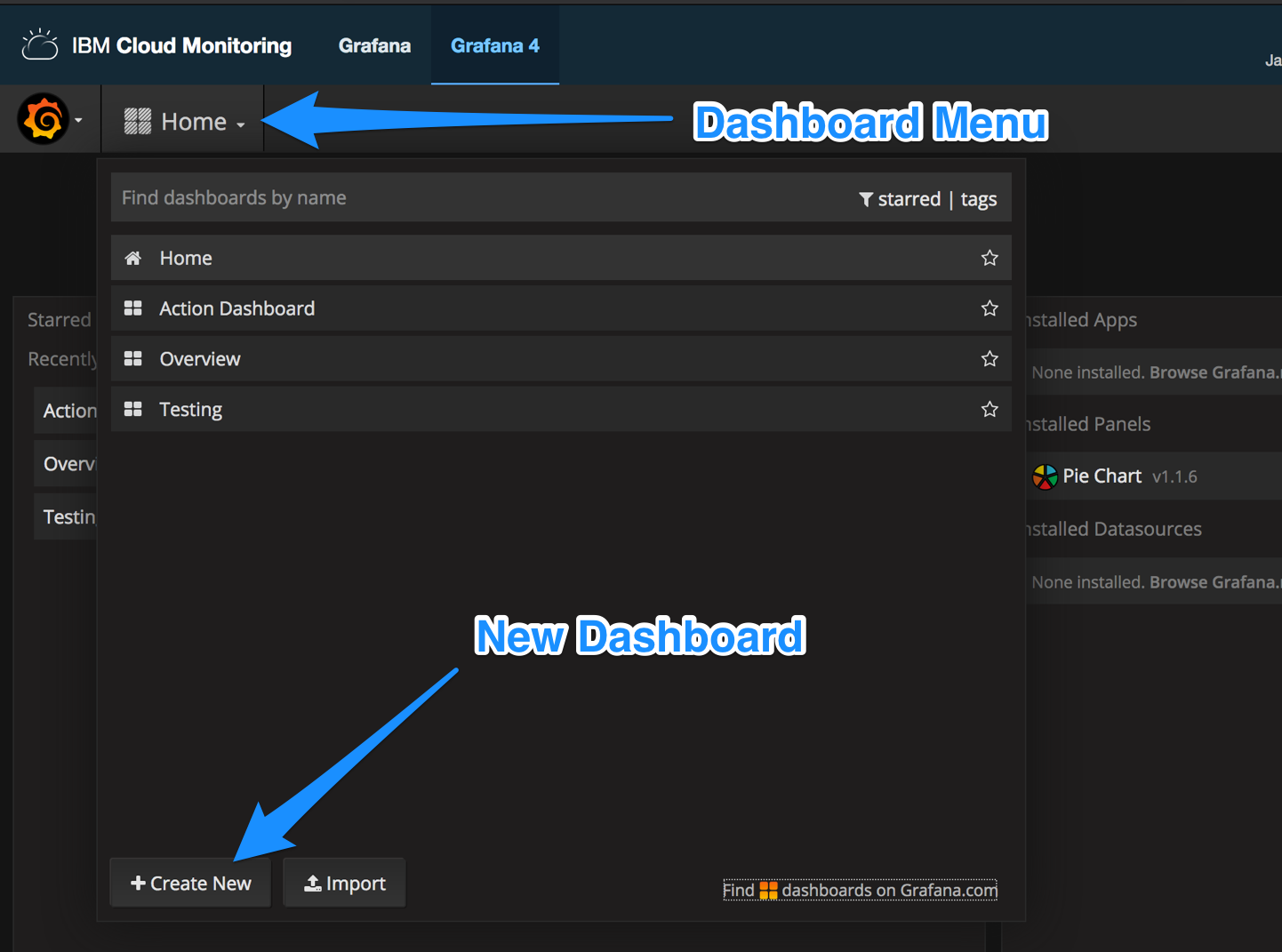
How to create a new dashboard?
- Open the dashboard menu by clicking the drop-down menu.
- Click the “Create New” button.
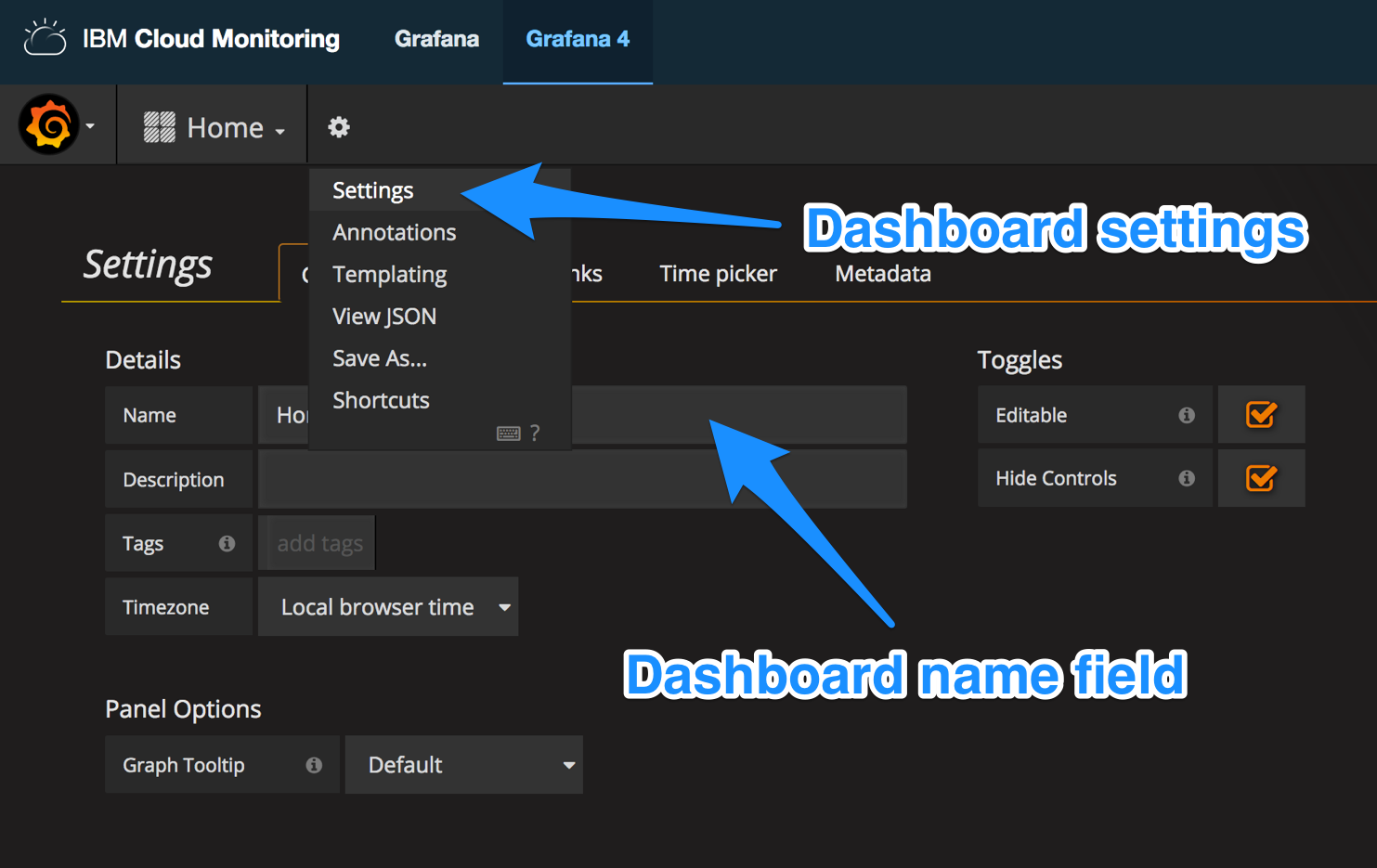
How to set the dashboard name?
- Select the “Manage Dashboard” menu option.
- Click “Settings” to open the dashboard options panel.
- Change the “General -> Details -> Name” configuration value.
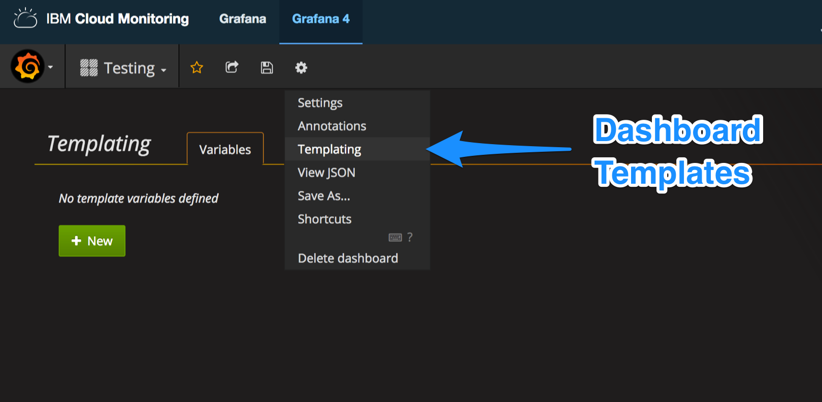
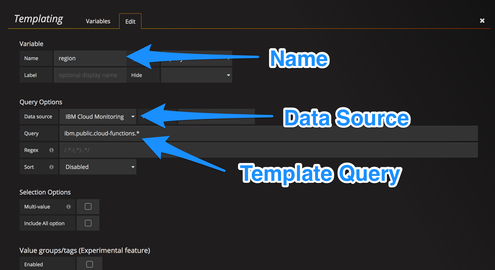
How to set dashboard template variables?
- Select the “Manage Dashboard” menu option.
- Click “Templating” to open the templating variables configuration panel.
- Click “New” button to define template variables.
- Fill in the name field with the template identifier.
- Select “IBM Cloud Monitoring” as the data source.
- Fill in the query field with chosen metric query.
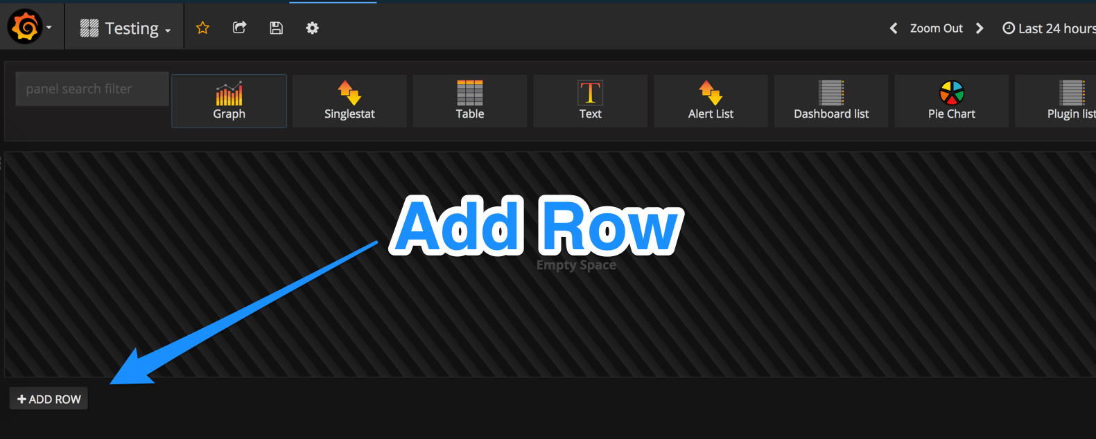
How to add new row to dashboard?
- Click the “Add Row” button beneath the last row.
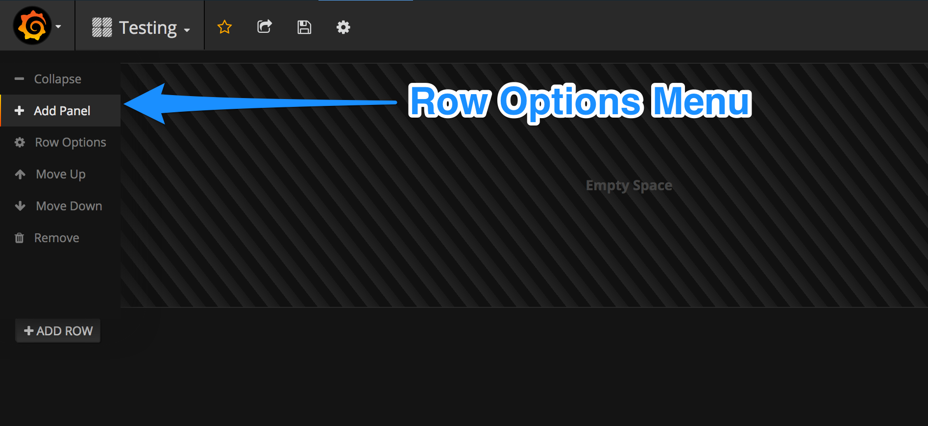
How to add new chart to row?
- Hover over the options menu on the right-hand side of the row.
- Select the “Add Panel” menu item.
- Choose a chart type from the panel menu.
How to set and display row name?
- Hover over the options menu on the right-hand side of the row.
- Select the “Row Options” menu item.
- Fill in the “Title” field. Click the “Show” checkbox.
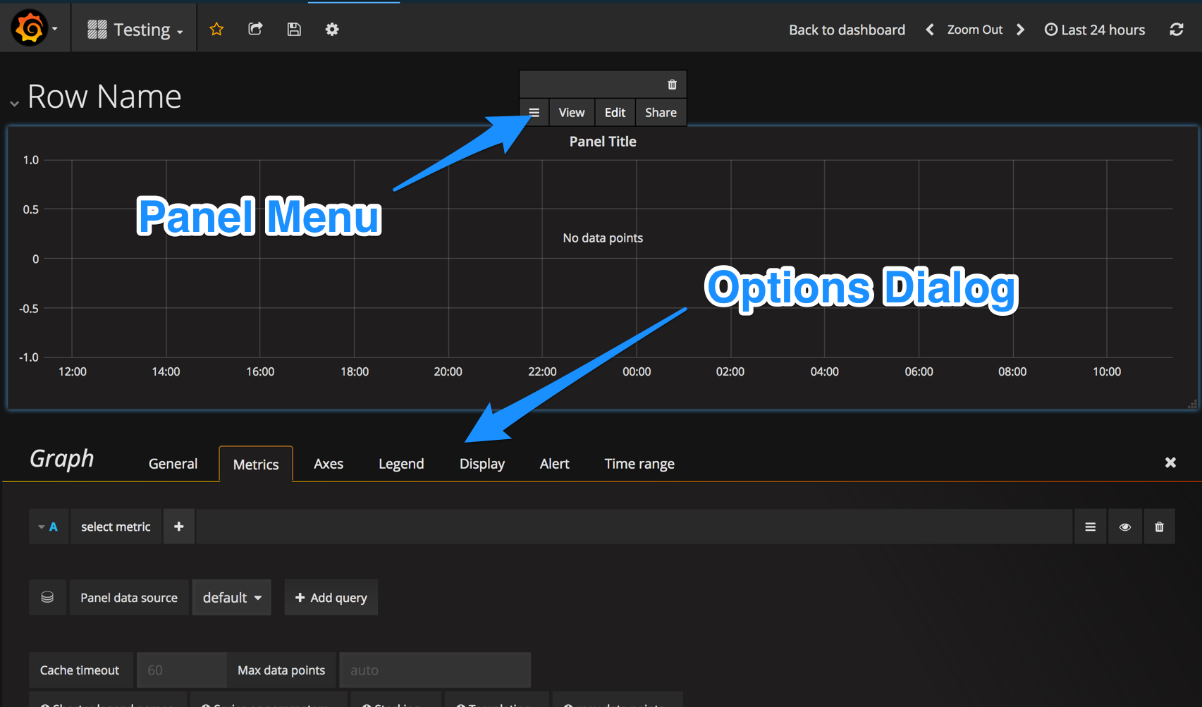
How to edit chart parameters?
- Click the panel title to open the panel options dialog.
- Select the “Edit” button.
- Graph options dialog opens below the chart panel.
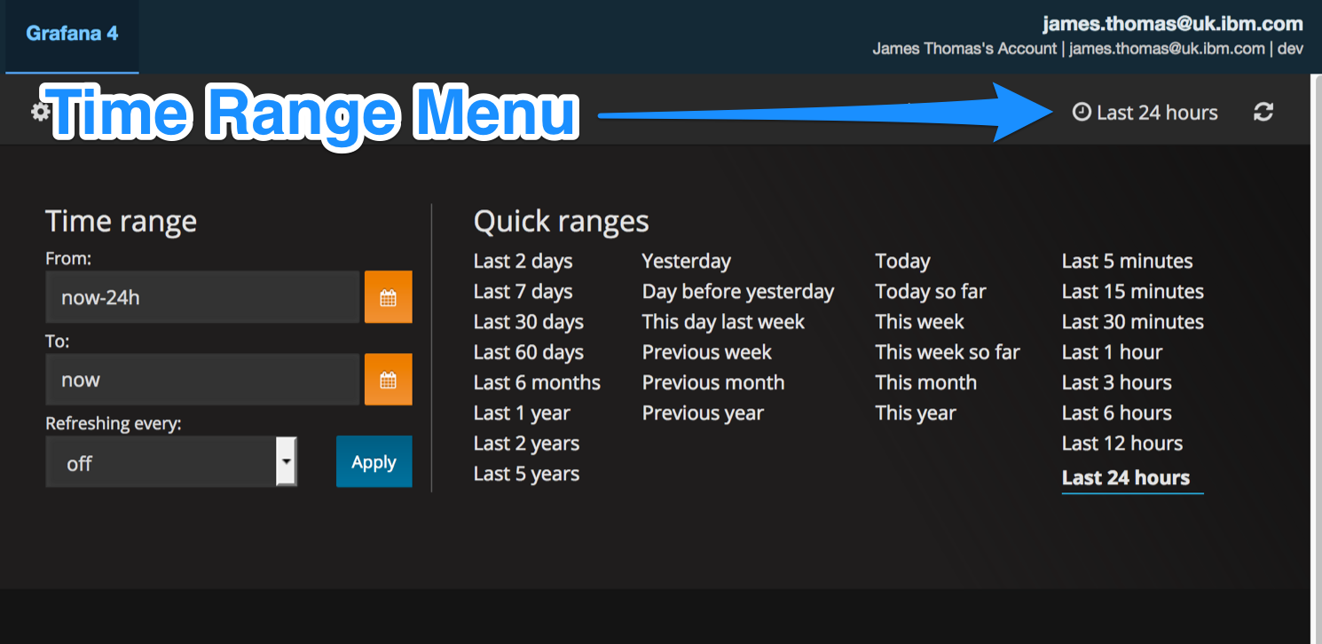
How to choose time range for metric values?
- Click the clock icon on the right-hand side of the menu bar.
- Define time ranges manually or by selecting options from the “Quick Ranges” examples.
- Auto-update can be enabled using the “Refresh” drop-down menu.
Dashboards
Having introduced some of the basics around using Grafana, we can now start to create dashboards.
tldr: want to set these dashboards up without following all the instructions?
Here are the completed JSON configuration files for the Grafana dashboards below. Remember to create the necessary template variables.
Overview Dashboard
This is an example of the first dashboard we want to create.
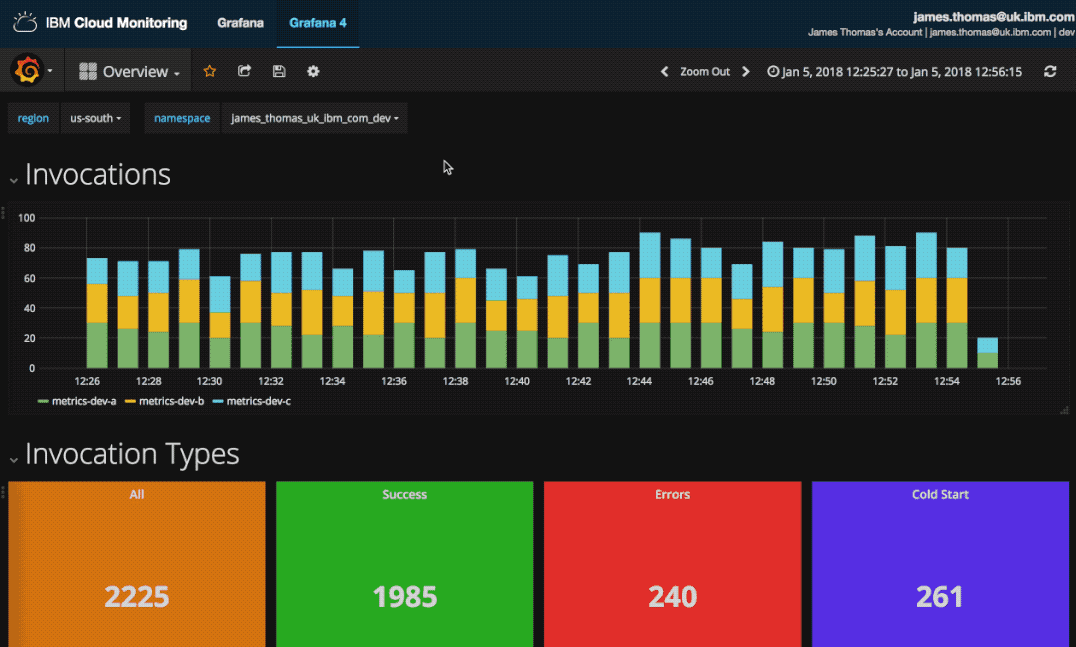
The dashboard provides information on actions invocations, errors, durations and other high-level metrics. It gives an overview of the performance of serverless applications within a region and workspace.
setup
- Create a new dashboard named “Overview”.
- Set the following template variables.
- $region =>
ibm.public.cloud-functions.* - $namespace =>
ibm.public.cloud-functions.$region.*
- $region =>
Once the dashboard is created, we can add the first row showing action invocation counts.
invocations graph
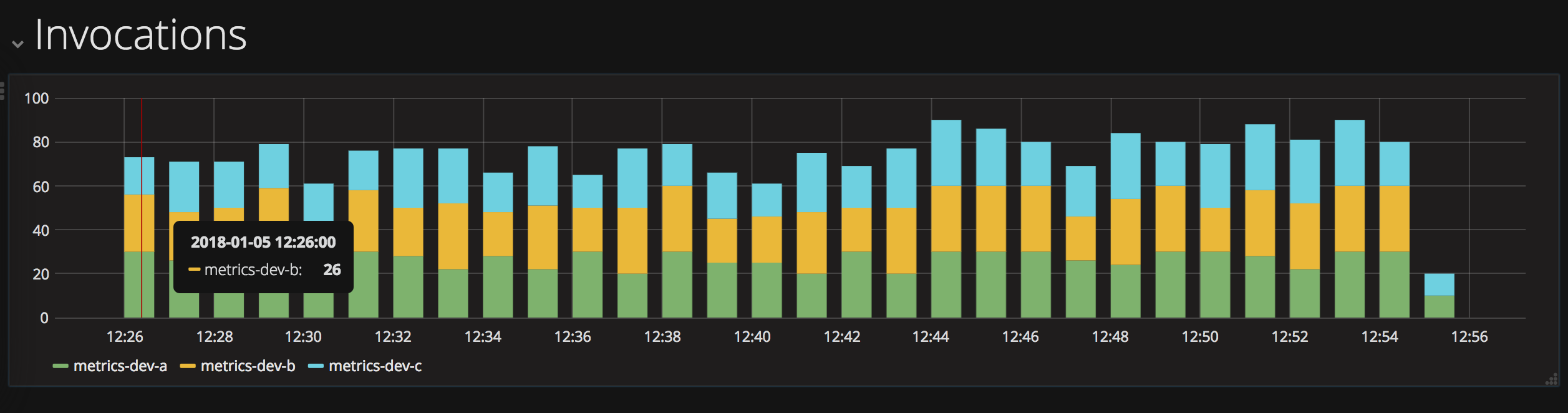
This dashboard row will contain a single graph, using a bar chart of action invocation frequencies over time intervals. Stacking, rather than overlaying, chart values makes it easier to identify counts per action.
How can we calculate total invocations from the metric values?
One approach is to convert all metric values for a chosen label to a constant value of 1. This can be achieved using the scale() and offset() functions. Adding these constant values will return a count of the invocations recorded.
Let’s implement this now…
- Set and display default row name as “Invocations”.
- Add new “Graph” chart to row.
- Configure metric query for chart:
ibm.public.cloud-functions.$region.$namespace.*.*.error
.scale(0).offset(1).groupByNode(5, sum)
- Set the following options to true.
- Legend->Options->Show
- Display->Draw Modes->Bars
- Display->Stacking & Null value->Stack
invocation types
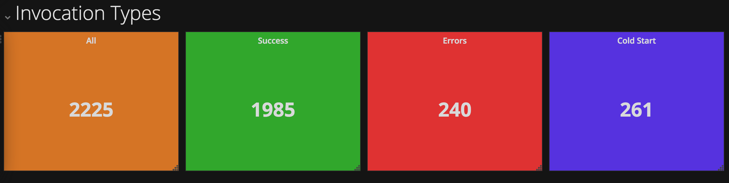
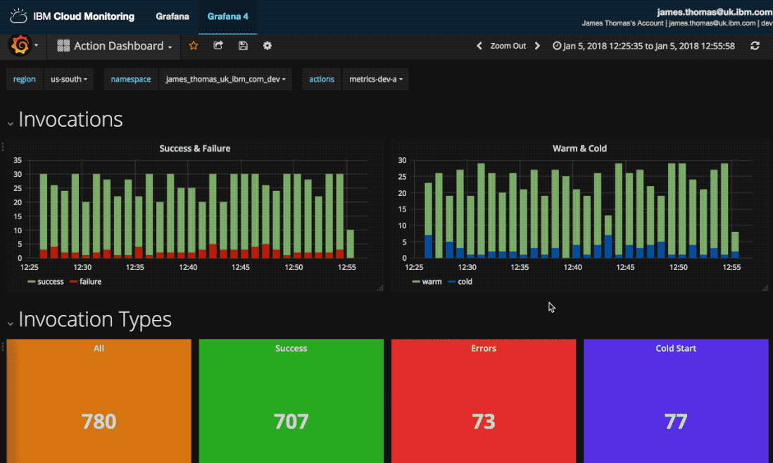
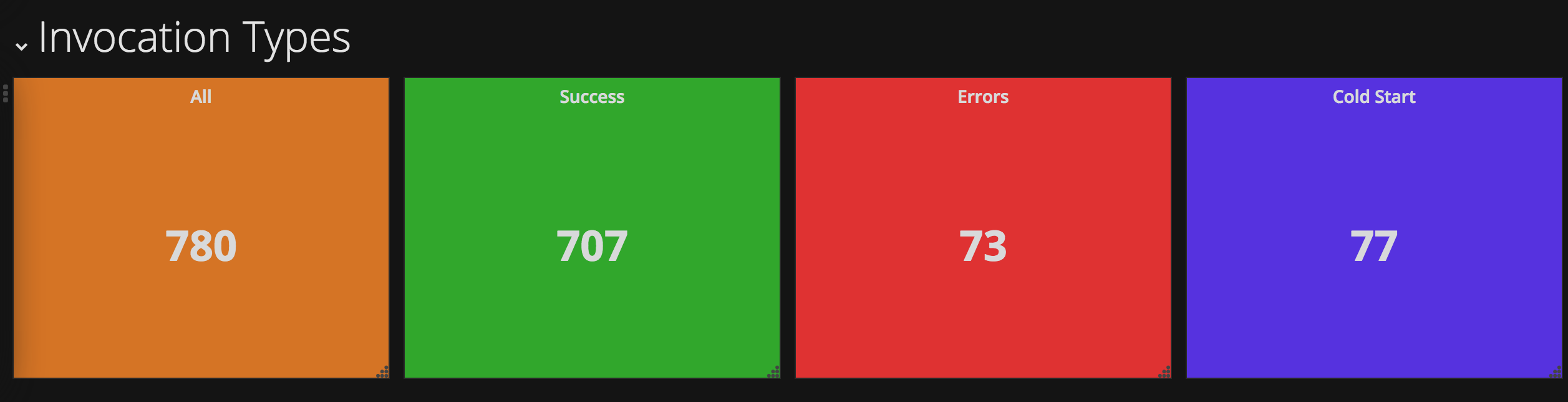
This next dashboard row will show counts for different invocation types. Counts will be shown for total, successful, failed and cold start invocations.
Calculating the sum for all invocations recorded will use the same “scale & offset” trick explained above. Cold start and error totals can be calculated by simply summing the individual metric values. Successful invocation counts can be created by offsetting and scaling error values by -1 before summing.
all count
- Add a new row.
- Set and display default row name as “Invocation Types”.
- Add a new “Single Stat” chart to row.
- Configure metric query for chart:
ibm.public.cloud-functions.$region.$namespace.*.*.error.scale(0).offset(1).sumSeries()
- Set the following options.
- General -> Info -> Title = All
- Options -> Value -> Stat = total
- Options -> Coloring -> Background = true
- Options -> Coloring -> Thresholds = 0,100000
success count
- Duplicate the “All” chart in the row.
- Change the metric query for this chart:
ibm.public.cloud-functions.$region.$namespace…error.offset(-1).scale(-1).sumSeries()
- Set the following options.
- General -> Info -> Title = Success
- Options -> Coloring -> Colors = Make green the last threshold colour.
- Options -> Coloring -> Thresholds = 0,0
errors count
- Duplicate the “Success” chart in the row.
- Change the metric query for this chart:
ibm.public.cloud-functions.$region.$namespace.*.*.error.sumSeries()
- Set the following options.
- General -> Info -> Title = Errors
- Options-> Coloring -> Colors = Make red the last threshold colour.
cold start count
- Duplicate the “Errors” chart in the row.
- Change the metric query for this chart:
ibm.public.cloud-functions.$region.$namespace.*.*.coldstart.sumSeries()
- Set the following options.
- General -> Info -> Title = Cold Start
- Options-> Coloring -> Colors = Make blue the last threshold colour.
invocation durations
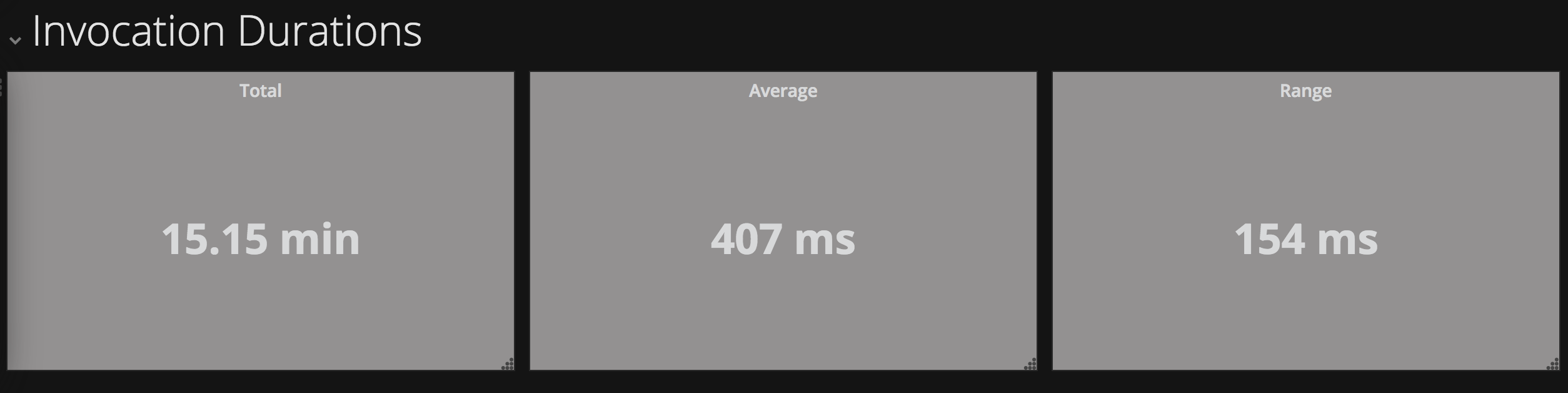
This row will contain counts for the total, mean and range of all invocations.
Duration is recorded as a metric value for each invocation. Grafana provides functions to calculate mean and range values from existing data series.
total duration
- Add a new row.
- Set and display default row name as “Invocation Durations”.
- Add a new “Single Stat” chart to row.
- Configure metric query for chart:
ibm.public.cloud-functions.$region.$namespace.*.*.time.duration.sumSeries()
- Set the following options.
- General -> Info -> Title = Total
- Options -> Value -> Stat = total
- Options -> Value -> Unit = milliseconds
- Options -> Coloring -> Background = true
- Options -> Coloring -> Thresholds = 100000000,100000000
- Options -> Coloring -> Colors = Make grey the first threshold colour.
average duration
- Duplicate the “Total” chart in the row.
- Change the metric query for this chart:
ibm.public.cloud-functions.$region.$namespace.*.*.time.duration.averageSeries()
- Set the following options.
- General -> Info -> Title = Average
- Options -> Value -> Stat = avg
range duration
- Duplicate the “Average” chart in the row.
- Set the following options.
- General -> Info -> Title = Range
- Options -> Value -> Stat = range
invocation details table
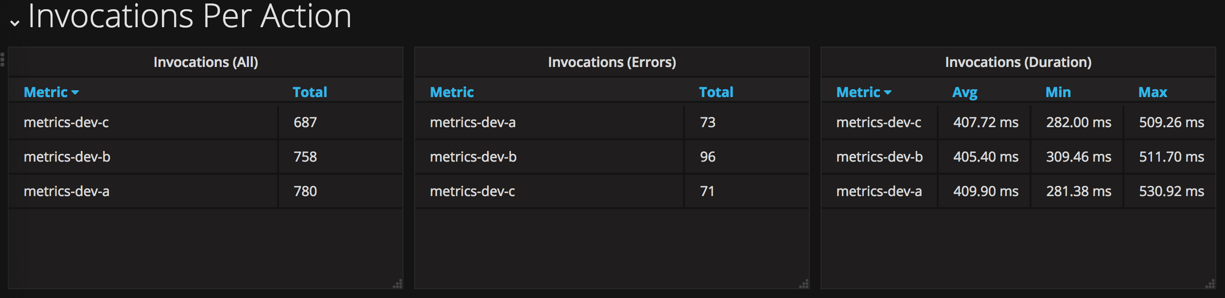
Tables will show invocation details per action in this row. Invocation counts, errors recorded and duration statistics are shown in separate tables.
all invocations table
- Add a new row.
- Set and display row name as “Invocations Per Action”.
- Add a “Table” panel to the row.
- Configure metric query for chart:
ibm.public.cloud-functions.$region.$namespace.*.*.error
.scale(0).offset(1).groupByNode(5, sum)
- Set the following options.
- General -> Info -> Title = Invocations (All)
- Options -> Data -> Table Transform = Time series aggregations
- Options -> Data -> Columns = Total
- Options -> Column Styles -> Decimals = 0
error invocations table
- Duplicate the “Invocations (All)" chart in the row.
- Configure metric query for chart:
ibm.public.cloud-functions.$region.$namespace.*.*.error.groupByNode(5, sum)
- Set the following options.
- General -> Info -> Title = Invocations (Errors)
duration statistics table
- Duplicate the “Invocations (Errors)" chart in the row.
- Configure metric query for chart:
ibm.public.cloud-functions.$region.$namespace.*.*.error.groupByNode(5, avg)
- Set the following options.
- General -> Info -> Title = Invocations (Duration)
- Options -> Data -> Columns = Avg, Min, Max
- Options -> Column Styles -> Decimals = Milliseconds
- Options -> Column Styles -> Decimals = 2
Having finished all the charts for the overview dashboard, it should look like the example above.
Let’s move onto the second dashboard, which will give us more in-depth statistics for individual actions…
Action Dashboard
This is an example of the second dashboard we want to create.
The dashboard provides information on specific action application metrics. It includes more detailed statistics including duration percentiles, memory and cpu usage. This provides more context to help diagnosing issues for individual actions.
setup
- Create a new dashboard named “Action Details”.
- Set the following template variables.
- $region =>
ibm.public.cloud-functions.* - $namespace =>
ibm.public.cloud-functions.$region.* - $actions =>
ibm.public.cloud-functions.$region.$namespace.<action>
- $region =>
Replace <action> with the name of an action you are monitoring.
invocations
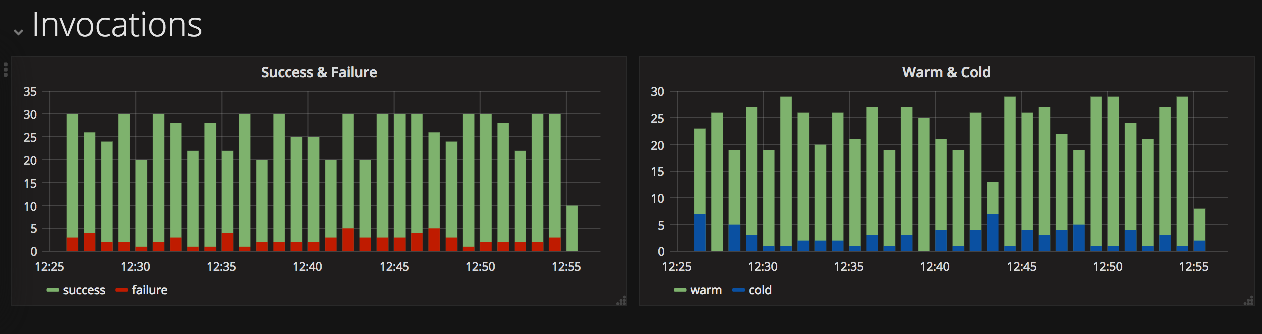
Action invocations are shown this first dashboard row. Bar charts display successful versus failed invocations and cold versus warm starts.
Failed invocations and cold starts are recorded as metric values. Using the
scale() and offset() functions allows us to calculate successful invocations
and warm starts from these properties.
- Set and display default row name as “Invocations”.
- Add new “Graph” chart to row.
- Configure two metric queries for the chart:
ibm.public.cloud-functions.$region.$namespace.$action.*.error
.scale(0).offset(1).groupByNode(5, sum).alias(success)
ibm.public.cloud-functions.$region.$namespace.$action.*.error
.groupByNode(5, sum).alias(failure)
- Set the following options to true.
- Legend->Options->Show
- Display->Draw Modes->Bars
invocation types
This row replicates the “Invocation Types” row from the “Overview” dashboard.
Repeat the instructions from the above to create this row here.
Metric query settings must use the action template identifier rather than a wildcard value.
invocation durations

This row uses an extended version of the durations row from the “Overview” dashboard. In addition to total and average durations, minimum and maximum are also included.
Repeat the instructions from above to add the “Total” and “Average” panels.
Metric query settings must use the action template identifier rather than a wildcard value.
minimum duration
- Duplicate the “Total” chart in the row.
- Change the metric query for this chart:
ibm.public.cloud-functions.$region.$namespace.$action.*.time.duration.minSeries()
- Set the following options.
- General -> Info -> Title = Min
- Options -> Value -> Stat = min
maximum duration
- Duplicate the “Minimum” chart in the row.
- Change the metric query for this chart:
ibm.public.cloud-functions.$region.$namespace.$action.*.time.duration.maxSeries()
- Set the following options.
- General -> Info -> Title = Min
- Options -> Value -> Stat = max
percentiles graph
- Add a “Table” panel to the row.
- Configure this metric query for the chart:
ibm.public.cloud-functions.$region.$namespace.$action.*.time.duration
.percentileOfSeries(50, false).aliasByNode(5).alias($actions 50th percentile)
- Duplicate this query three times, replacing
50with90,95and99. - Set the following options.
- General -> Info -> Title = Durations (Percentiles)
- Axes -> Left Y -> Unit = Milliseconds
- Legend -> Options -> Show = True
- Legend -> Values -> Avg = True
- Display -> Draw Modes = Lines & Points
- Display -> Stacking & Null value -> Null Value = connected
cpu usage
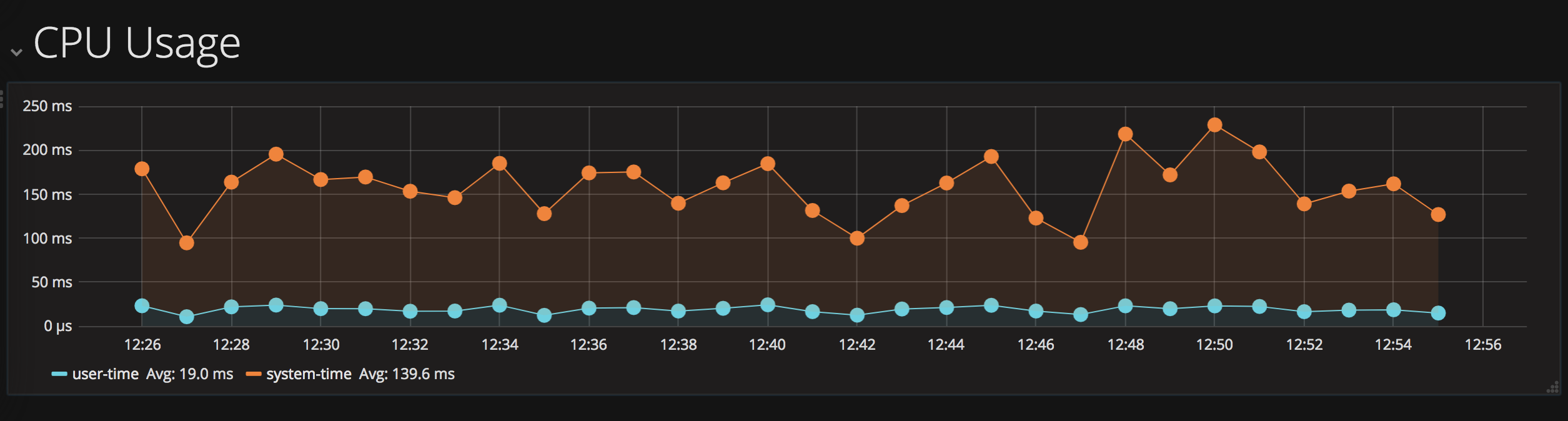
CPU usage for the Node.js process is recorded with two metric values, user and system time.
- Add a new row.
- Set and display row name as “CPU Usage”.
- Add new “Graph” panel to row.
- Configure two metric queries for the chart.
ibm.public.cloud-functions.$region.$namespace.$actions.cpu.user
.groupByNode(5, avg).alias(user-time)
ibm.public.cloud-functions.$region.$namespace.$actions.cpu.system
.groupByNode(5, avg).alias(system-time)
- Set the following options.
- Axes -> Left Y -> Unit = Microseconds
- Legend -> Values -> Avg = true
- Display -> Draw Modes = Lines & Points
- Display -> Stacking & Null value -> Stack = true
- Display -> Stacking & Null value -> Null Value = connected
memory usage
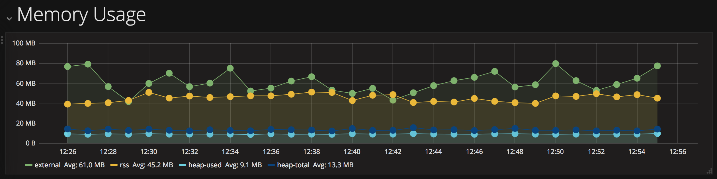
Memory usage for the Node.js process is recorded with multiple values, including heap used & total, external and rss.
- Add a new row.
- Set and display row name as “Memory Usage”.
- Add new “Graph” panel to row.
- Configure four metric queries for the chart using this template.
ibm.public.cloud-functions.$region.$namespace.$actions.*.memory.<label>
.groupByNode(5, avg).alias(<label>)
Replace <label> with following options: external, rss, heapUsed & heapTotal.
- Set the following options.
- Axes -> Left Y -> Unit = bytes
- Legend -> Values -> Avg = true
- Display -> Draw Modes = Lines & Points
- Display -> Stacking & Null value -> Stack = true
- Display -> Stacking & Null value -> Null Value = connected
Having finished all the charts for the action details example, you should now have dashboards which look like the examples above! 📈📊📉
conclusion
Once you are collecting application metrics for IBM Cloud Functions (Apache OpenWhisk) applications, you need to be able to monitor metric values in real-time.
Grafana dashboards, hosted by the IBM Cloud Monitoring service, are a perfect solution for this problem. Building custom dashboards allows us to monitor incoming data values live.
In the next blog post, we’re going to finish off this series by looking at setting up automatic alerts based upon the metric values…